Last week I studied and practiced Python programming from Codeacademy's online Python Course. This is a really nice, easy to follow and interactive course. Estimated course time is 13 hours but it took me nearly 26 hours to finish. After finishing the course, I decided to analyze data using Python to familiarize myself with Python's Data Analysis Library: Pandas, Scientific Computing Libraries : NumPy, SciPy, Plotting Library: matplotlib (IMO: ggplot2 package in R plots much better looking plots compared to matplotlib plots), and scikit-learn for Machine Learning in Python.
For analyzing data I am using Titanic: Machine Learning from Disaster data from Kaggle's knowledge based competition, a major reason to use this data is that there are a lot of online Python tutorials and blogs that use this data and this makes learning/understanding easier.
Note: This is not a tutorial. The data analysis done here is based on various online Titanic Data related Python tutorials/blogs.
#############################################################
### Kaggle Competition: Titanic Machine Learning from Disaster
# Import important libraries and modules
import matplotlib.pyplot as plt
import numpy as np
import pandas as pd
import pylab as p
import sklearn as sol
# Reading Titanic (training) data
train = pd.read_csv("/Users/Ankoor/Desktop/Python/Kaggle/Titanic/train.csv")
# View dataframe
train
# View first 'n' rows (R*)
train.head(5)
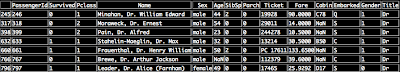
Out:
train.tail(3)
# Get column names (features / attributes) in data frame [Similar to R's names()]
list(train)
Out:

# What kind of data array is 'train'?
type(train)
Out: pandas.core.frame.DataFrame
train.dtypes
PassengerId int64
Survived int64
Pclass int64
Name object
Sex object
Age float64
SibSp int64
Parch int64
Ticket object
Fare float64
Cabin object
Embarked object
dtype: object
train.info()
Out:

There are 891 observations. Features 'Age' (714 observations remaining), 'Cabin' (204 observations remaining) and 'Embarked' (889 observations remaining) have missing data.
# Checking missing values in the data: Age and Cabin
sum(train['Age'].isnull())
Out: 177
177 'Age' observations missing
sum(train['Cabin'].isnull())
Out: 687
687 'Cabin' observations missing
Note: .isnull() does not work for 'str'
# Describe data: Count, Mean, STD, Min, Max [Similar to R's summary()]
train.describe()
Out:

train['Age'][0:10]
Out:

train.Age[0:10]
# Type of referenced data?
type(train['Age'])
type(train.Age) # another command to get type of referenced data
# Mean Age (Ignoring missing values)
train.Age.mean()
train['Age'].mean()
Out: 29.69911764705882
# Median Fare (Ignoring missing values)
train.Fare.median()
train['Fare'].median()
Out: 14.4542
# Unique values
train.Sex.unique()
Out: array(['male', 'female'], dtype=object)
train['Embarked'].unique()
Out: array(['S', 'C', 'Q', nan], dtype=object)
train['Pclass'].unique()
Out: array([3, 1, 2])
3 Passenger classes
train[['Sex', 'Pclass', 'Age']]

train[train['Age'] > 60]
Out:

train[train['Age'] > 60][['Sex', 'Pclass', 'Age', 'Survived']]
Out:

# Filtering and sub-setting data with missing values
train[train['Age'].isnull()][['Sex', 'Pclass', 'Age', 'Survived']]
# Counting # of males in each passenger class
for i in range(1, 4):
print i, len(train[(train['Sex'] == 'male') & (train['Pclass'] == i)])
Out:
1 122
2 108
3 347
# Counting # of females in each passenger class
for i in range(1, 4):
print i, len(train[(train['Sex'] == 'female') & (train['Pclass'] == i)])
Out:
1 94
2 76
3 144
# Simple Histogram of Age
train['Age'].hist()
p.show()
Out:

# Histogram of Age (after dropping missing values), alpha controls 'transparency'?
train['Age'].dropna().hist(bins = 16, range = (0, 80), alpha = 0.5)
Out:


## Cleaning data: Transforming 'String values'
# 1. Adding a new column and filling it with a number
train['Gender'] = 4
# 2. Populating the new column 'Gender' with M or F
train['Gender'] = train['Sex'].map(lambda x: x[0].upper())
# 3. Populating the new column witn binary integers
train['Gender'] = train['Sex'].map({'female': 0, 'male': 1}).astype(int)
## Feature Engineering: Name attribute has honorific titles like Mr., Mrs., etc
# Extracting salutation from Name (Format: Last Name, Title, First Name)
# Name example: Dahlberg, Miss. Gerda Ulrika
def title(name):
temp_1 = name.split(',') # Split by (,)
temp_2 = temp_1[1].split('.')[0] # Split by (.)
temp_3 = temp_2.strip() # Remove white space
return temp_3
train['Title'] = train['Name'].apply(title) # Apply function 'title' to 'Name'
train[['PassengerId', 'Survived', 'Sex', 'Pclass', 'Age', 'Gender', 'Title']]
Out:


## How to count passenger by Title
# Grouping by Title
temp_4 = train.groupby('Title')
# Counting passengers by Title
temp_5 = temp_4.PassengerId.count()
print temp_5
Out:


# Barplot: Passenger count by title
temp_5.plot(kind = 'bar')
Out:

Majority of passengers had 4 honorific titles: Mr, Mrs, Miss, and Master. I will rename (1) honorific titles like Capt, Don, Dr, Jonkheer, Major, Rev and Sir to Mr; (2) honorific titles like Lady, Mme, Ms, and the Countess to Mrs; (3) honorific titles like Mlle to Miss
# How many males and females are Doctors?
train[train['Title'] == 'Dr']
Out:

6 male doctors and 1 female doctor (Dr. Alice (Farnham) Leader)
## Create a 'Temp' column in train and fill it with concatenated 'Sex' and 'Title' string values
train ['Temp'] = train['Sex'] + train['Title']
## Replace concatenated value 'femaleDr' value with 'Mrs'
train.loc[train['Temp'] == 'femaleDr', 'Title'] = 'Mrs'
# Drop 'Temp' column
train = train.drop(['Temp'], axis = 1)
## There are 4 main titles: Mr, Mrs, Master and Miss, and some other titles
# Taking care of other titles
def new_title(title):
if title == 'Mr' or title == 'Capt' or title == 'Don' or title == 'Dr' or title == 'Jonkheer' or title == 'Major' or title == 'Rev' or title == 'Sir' or title == 'Col':
return 'Mr'
elif title == 'Mrs' or title == 'Lady' or title == 'Mme' or title == 'Ms' or title == 'the Countess':
return 'Mrs'
elif title == 'Miss' or title == 'Mlle':
return 'Miss'
else:
return 'Master'
train['NewTitle'] = train['Title'].apply(new_title)
# Drop 'Title' attribute
train = train.drop(['Title'], axis = 1)
# Grouping by Title
temp_6 = train.groupby('NewTitle')
# Counting passengers by Title
temp_7 = temp_6.PassengerId.count()
print temp_7
temp_7.plot(kind = 'bar')
temp_7.plot(kind = 'bar')
Out:


Out:


Now all the passenger honorific titles have been updated.
## Now descriptive statistics plots to understand data and survival chance
train.boxplot(column = 'Age', by = 'NewTitle')

Outliers: Miss with Age around 60? I used train[(train['Age'] > 30) & (train['NewTitle'] == 'Master')] and found that some females with age > 30 years have 'Miss in their title (May be they were unmarried or some other reason)
train.boxplot(column = 'Fare', by = 'Pclass')
Out:

Outliers: Some passengers in First Class have paid more than $200 for tickets, may be they have paid for their whole family.
# Passenger distribution by Passenger Class and Survival Chance
group_1 = train.groupby('Pclass').PassengerId.count()
group_1.plot(kind = 'bar')
Out:

Out:

Almost half of the passengers were 3rd class passengers
group_2 = train.groupby('Pclass').Survived.sum()
Pclass_Survival_Prob = group_2/group_1
Pclass_Survival_Prob.plot(kind = 'bar', color = 'pink', alpha = 0.65)
Out:
Out:

However, more First Class and Second Class passengers survived compared to passengers in Third Class (May be better access to Lifeboats/Life Jackets, or easy access to upper decks?)
# Passenger distribution by Passenger Class, Gender and Survival Chance
# Barplot using Cross-tabulation
group_3 = pd.crosstab([train.Pclass, train.Sex], train.Survived)
group_3.plot(kind = 'bar', stacked = True, color = ['black', 'yellow'])
Out:


group_5 = pd.crosstab([train.Pclass, train.NewTitle], train.Survived)
group_5.plot(kind = 'bar', stacked = True, color = ['black', 'yellow'])
Out:

group_6 = pd.crosstab([train.Embarked, train.NewTitle], train.Survived)
group_6.plot(kind = 'bar', stacked = True, color = ['black', 'yellow'])
Out:

Out:

Compared to males more females survived the disaster.
# Some other related plots
group_4 = pd.crosstab([train.Pclass, train.Sex, train.Embarked], train.Survived)
group_4.plot(kind = 'bar', stacked = True, color = ['black', 'yellow'], alpha = 0.5)
group_4.plot(kind = 'bar', stacked = True, color = ['black', 'yellow'], alpha = 0.5)
Out:

group_5.plot(kind = 'bar', stacked = True, color = ['black', 'yellow'])
Out:

group_6.plot(kind = 'bar', stacked = True, color = ['black', 'yellow'])
Out:

# Feature Engineering: Family size
train['Family'] = train['SibSp'] + train['Parch']
group_7 = pd.crosstab([train.Pclass, train.Family], train.Survived)
group_7.plot(kind = 'bar', stacked = True, color = ['black', 'yellow'], alpha = 0.25)
train['Family'] = train['SibSp'] + train['Parch']
group_7 = pd.crosstab([train.Pclass, train.Family], train.Survived)
group_7.plot(kind = 'bar', stacked = True, color = ['black', 'yellow'], alpha = 0.25)
## Imputing missing values in attribute 'Age'. I found the code used below at this blog.
# View dataframe: 'Age' = NaN
train[train['Age'].isnull()].head()
table = train.pivot_table(values = 'Age', index = ['NewTitle'], columns = ['Pclass', 'Sex'], aggfunc = np.mean)
def ageFunc(x):
return table[x['Pclass']][x['Sex']][x['NewTitle']]
train['Age'].fillna(train[train['Age'].isnull()].apply(ageFunc, axis = 1), inplace = True)
train['Age'] = train['Age'].astype(int)
#Some more plots
#Specifying Plot Parameters
# figsize = (x inches, y inches), dpi = n dots per inches
fig = plt.figure(figsize = (11, 8), dpi = 1600)
# Plot: 1
ax1 = fig.add_subplot(221) # .add_subplot(rcp): r = row, c = col, p = position
female_hiclass = train['Survived'][train['Sex'] == 'female'][train['Pclass'] != 3].value_counts()
female_hiclass.plot(kind = 'bar', label = 'Female High Class', color = 'deeppink', alpha = 0.25)
ax1.set_xticklabels(['Survived', 'Dead'], rotation = 0)
ax1.set_xlim(-1, len(female_hiclass))
ax1.set_ylim(0, 400)
plt.legend(loc = 'best')
# Plot: 2
ax2 = fig.add_subplot(222) # .add_subplot(rcp): r = row, c = col, p = position
female_loclass = train['Survived'][train['Sex'] == 'female'][train['Pclass'] == 3].value_counts()
female_loclass.plot(kind = 'bar', label = 'Female Low Class', color = 'pink', alpha = 0.25)
ax2.set_xticklabels(['Survived', 'Dead'], rotation = 0)
ax2.set_xlim([-1, len(female_loclass)])
ax2.set_ylim(0, 400)
plt.legend(loc = 'best')
# Plot: 3
ax3 = fig.add_subplot(223) # .add_subplot(rcp): r = row, c = col, p = position
male_hiclass = train['Survived'][train['Sex'] == 'male'][train['Pclass'] != 3].value_counts()
male_hiclass.plot(kind = 'bar', label = 'Male High Class', color = 'teal', alpha = 0.25)
ax3.set_xticklabels(['Dead', 'Survided'], rotation = 0)
ax3.set_xlim(-1, len(male_hiclass))
ax3.set_ylim(0, 400)
plt.legend(loc = 'best')
# Plot: 4
ax4 = fig.add_subplot(224) # .add_subplot(rcp): r = row, c = col, p = position
male_loclass = train['Survived'][train['Sex'] == 'male'][train['Pclass'] == 3].value_counts()
male_loclass.plot(kind = 'bar', label = 'Male Low Class', color = 'green', alpha = 0.25)
ax4.set_xticklabels(['Dead', 'Survived'], rotation = 0)
ax4.set_xlim(-1, len(male_loclass))
ax4.set_ylim(0, 400)
plt.legend(loc = 'best')
Out:

Females in the high class had better survival chance compared to females in low class. Irrespective of the class more male passengers perished compared to females.
Interesting data set! Nice plots and way to get familiar with python! So can you determine which ID number was DiCaprio?
ReplyDeletei have to gget the synopsis of the titanic project asap. plz provide me
ReplyDelete
ReplyDeleteThe development of artificial intelligence (AI) has propelled more programming architects, information scientists, and different experts to investigate the plausibility of a vocation in machine learning. Notwithstanding, a few newcomers will in general spotlight a lot on hypothesis and insufficient on commonsense application. IEEE final year projects on machine learning In case you will succeed, you have to begin building machine learning projects in the near future.
Projects assist you with improving your applied ML skills rapidly while allowing you to investigate an intriguing point. Furthermore, you can include projects into your portfolio, making it simpler to get a vocation, discover cool profession openings, and Final Year Project Centers in Chennai even arrange a more significant compensation.
Data analytics is the study of dissecting crude data so as to make decisions about that data. Data analytics advances and procedures are generally utilized in business ventures to empower associations to settle on progressively Python Training in Chennai educated business choices. In the present worldwide commercial center, it isn't sufficient to assemble data and do the math; you should realize how to apply that data to genuine situations such that will affect conduct. In the program you will initially gain proficiency with the specialized skills, including R and Python dialects most usually utilized in data analytics programming and usage; Python Training in Chennai at that point center around the commonsense application, in view of genuine business issues in a scope of industry segments, for example, wellbeing, promoting and account.